Statistics for Digital Marketers: Descriptive Statistics Crash Course
Go beyond the default insights offered by GA4.
As digital analytics professionals, our roles involve collecting, processing, and interpreting large amounts of data to provide value to our stakeholders. Learning some statistics gives us a set of tools and methodologies to turn raw data into meaningful insights.
I’ve personally struggled understanding statistics in the past, and I know how overwhelming it can feel. When working in stakeholder requests, it’s easy to become bogged down by the daily complexities of our datasets and get lost in the variance.
Hopefully by exploring statistics together, we'll both get better at answering common stakeholder questions such as:
- Why did the numbers go up or down?
- Did the marketing campaign have a meaningful impact?
- Is this metric within normal ranges, or has something changed?
Ultimately, statistics help us not only describe what’s happening on our platforms, but also understand why it’s happening and predict what might happen next.
In this series of articles, we'll dive into fundamental statistical concepts and see how they apply to digital analytics.
The goal is for both of us to gradually build our understanding and learn how to incorporate these concepts into our daily work, making our data analysis more effective and insightful.
The first few articles will be a bit theoretical, but the idea is to gradually publish more practical examples that leverage this shared understanding.
Without boring you for longer, here is the first article in the series...
Descriptive Statistics Crash Course
As digital marketers, we're constantly swimming in a sea of data—website traffic, click-through rates, conversion metrics, social media engagement, email open rates, and more. But raw data is just noise unless we know how to interpret it. That's where statistics come in.
In statistics, there's a key distinction between descriptive and inferential statistics. Think of your dataset as a giant puzzle.
- Descriptive Statistics are like sorting and organizing your puzzle pieces. You group similar pieces together, count how many pieces of each type you have, and arrange them to see patterns and shapes. This helps you understand what your data looks like without making any guesses about missing pieces or what the complete picture is.
- Inferential Statistics are like trying to guess what the complete puzzle picture looks like based on the pieces you've organized. You use information from your sorted pieces to make educated predictions about the entire puzzle, even the parts you haven't seen yet.
Before attempting to make any inferences, it's essential to first understand what your dataset looks like. That's where descriptive statistics come into play.
The Key Components of Descriptive Statistics
Descriptive statistics focus on several main components that help summarize and interpret your data, in this blog post we will focus on the following:
- Measures of Central Tendency
- Measures of Variability
- Distribution and Shape
- Measures of Association
Measure of Central Tendency and Variability
Measures of central tendency help you understand what is typical in your dataset.
For this example and all the ones you'll see later in this guide, we'll use a table that includes the session date, session ID, number of pageviews per session, and the session duration:
SELECT
event_date,
CONCAT(user_pseudo_id, "-", (SELECT value.int_value from UNNEST(event_params) where key = 'ga_session_id')) as session_id,
COUNTIF(event_name = "page_view") as page_view_count,
((MAX(event_timestamp) - MIN(event_timestamp))/1000000 )as session_duration_seconds
 FROM `datawithjavi.analytics_459549126.events_*`
 WHERE _table_suffix between "20240901" and "20240929"
 GROUP BY session_id, event_date
Code block to get a count of page_views and total session time per session per date.
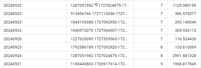
- Mean (Average): Add up all the numbers and divide by the count of numbers.
- More affected by outliers in the dataset.
- Our Mean pageviews per sessions = 3
- Median: The middle value of when the data is ordered from lowest to highest.
- Less impacted by outliers than the mean.
- Our median pageviews per session = 1
- Mode: Most frequent value.
- Our mode= 1
Understanding typical performance is super important. For example, looking at this data we already know that most of the sessions we are bringing to the site have low engagement.
However, looking at the difference between the mean and the median might suggest to us that our data set might have a couple of outliers. Which might prompt us to try and understand: what makes these users different?
Measures of Variability
These measures describe how spread out the data is, which helps us understand the consistency and reliability of our metrics.
For example, if we know that our pageviews per session metric has a lot of variability, we can infer that most sessions are very different from each other, and should consider daily changes of the metric to be "normal".
- Range: The difference between the maximum and minimum values.
- A large range indicates significant variability.
- Our range is of 39 pageviews as there are sessions that do not contain a pageview (confusing web behavior that is quite typical)
- Variance: The average of the squared differences from the mean.
- Gives you a sense of how much data varies from the mean. A high variance means more inconsistency.
- Our pageview per session variance = 26.95
- Less understandable in the context of your data since it is in squared units but good for statistical calculations.

- Standard Deviation: The square root of the variance, represents your average distance from the mean.
- The number is at in the same units/scale as your orginial data, so its more intuitive than the variance.
- Our standard deviation is 5.19 pageviews per session. This means that on average each session differs by about 5 pageviews from the mean.
- Because the mean is used to calculate this metric, it can be impacted by the presence of outliers.
- Interquantile Range: The difference between the value at the 25th percentile and the 75th percentile.
- The number preserves the same units/scale as your original metrics.
- Can be a better representation of variance in datasets that are not normally distributed.
- Shows where the middle 50% of your data lies.
- In our example, the IQR = 2, since the 25ht percentile = 1 and the 75th = 3.
Since our standard deviation is higher than our mean, we can infer that our data set has high variation and is not normally distributed.
Distribution and Shapes
The way your data spreads out tells you a lot about what's going on. By understanding the shape of your data distribution, you can spot patterns, catch weird outliers, and make smarter decisions based on how your users behave.
Quick Tip: The fastest way to get a feel for your data’s distribution is by creating a histogram or other frequency charts.
Think of a histogram as a simple bar chart that shows how often different values occur within certain ranges
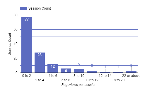
By plotting the histogram, we can see that:
- Most of our sessions center around the 0-2 pageviews range.
- As the number of pageviews per session increases the frequency of these sessions sharply decreases.
- We also notice a set of outlier sessions with high pageview counts, indicating deep navigation.
Armed with this information we can start coming up with research questions and hypothesis to validate later on, such as:
- What are those users with tons of page views looking at?
- Is the high page view count a tracking glitch, or is there something we can learn to engage more users?
- How can we boost overall engagement? Maybe improve site navigation or add more engaging content?
Skewness
As you've seen above where we plotted the distribution of pageviews per session, most of our data is on the left of the graph. Then a long tail extends towards the right of the mean.
This indicates that we are dealing with a skewed distribution, specifically a postively skweed distribution.
- Positive Skew (Right-Skewed): Tail extends to the right; the bulk of data is on the left.
- Negative Skew (Left-Skewed): Tail extends to the left; the bulk of data is on the right.
What are the implications?
Not Normal: Skewed distributions aren’t your typical bell-shaped curves. Don't worry about this now, what you need to know is that this affects which statistical methods you should use because many assume normality.
Choosing the Right Measures: In skewed distributions, some measures such as the mean or the standard deviation might give you a muddy picture of your data.
- Mean vs. Median: In a skewed distribution, the mean is pulled toward the tail due to outliers. The median might give you a better sense of the "middle" behavior.
- For example, in our skewed distribution the mean is 3 and the median is 1. Looking at the histogram, we can clearly see that 1 represents a better measure of our data sets central tendency.
- Standard Deviation vs Interquartile Range: Similar to the mean, a standard deviation is influenced by outliers.
- In our example, the SD = 5 while the IQR= 2. 2 pageviews is a better representation of how much on average each data point might differ from the mean.
Skewness is a bit harder to calculate and is not something that we can easily do in lookerstudio, so we will skip this for now. However, just know that in some cases, plotting the histogram will let you easily identify this without having to go through the process of calculating it.
If you want to know how to calculate skewness, here is some reading.
Correlation Explores Relationships between Variables
Imagine you’re at a bustling café, observing the interactions between customers and the baristas. You notice something interesting: the more customers come in, the faster the baristas work. There seems to be a relationship between the number of customers and the speed of service. This observation is a perfect analogy for understanding correlation in statistics.
What is Correlation?
At its core, correlation measures the relationship between two variables. It tells us whether and how strongly pairs of variables are related. In the café example, the two variables are the number of customers and the speed of service.
Correlation helps us understand whether these variables move together, move in opposite directions, or have no discernible pattern.
Types of Correlation
There are three primary types of correlation:
- Positive Correlation: Both variables move in the same direction. For instance, as the number of customers increases, the speed of service might also increase if baristas become more efficient under pressure.
- Negative Correlation: One variable increases while the other decreases. Imagine if, as the number of customers increases, the quality of service decreases because baristas are overwhelmed.
- No Correlation: There’s no apparent relationship between the variables. For example, the number of customers and the color of the café’s walls likely have no connection.
The Caveats: Correlation Isn’t Causation
While correlation is a powerful tool, it’s crucial to remember that correlation does not imply causation. Just because two variables move together, doesn’t mean one causes the other. For instance, in our café analogy, the increase in customers might correlate with faster service, but it doesn’t necessarily mean that having more customers causes the baristas to work faster. There could be other factors at play, such as baristas’ experience or peak hours.
Similarly, in digital analytics, a positive correlation between page views and conversions doesn’t mean that increasing page views will directly cause more conversions. It could be that highly engaged users tend to view more pages and are also more likely to convert. To establish causation, further analysis and experimentation, such as A/B testing, are necessary.
How to Calculate Correlation Using Google Tools
Statisticians use correlation coefficients to measure the relationship between two variables, the most common one being the Pearson Coefficient which ranges from -1 to 1.
- +1 indicates a perfect positive correlation.
- -1 signifies a perfect negative correlation.
- 0 means there’s no correlation at all.
Unfortunately, Looker Studio doesn’t have a built-in feature to calculate correlation coefficients directly. But don’t worry! There are still ways to explore the relationships between your metrics.
1. Visualizing Correlation with Scatter Plots
A scatter plot is a powerful tool to visually check out the relationship between two variables.
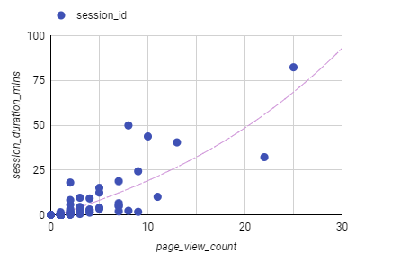
A well constructed scatterplot can show us that as pageview counts rise, we can see that the session duration trends higher. This doesn't mean that more pages being viewed are generating longer sessions, just that they seem to be related.
But, what is the actuall correlation?
- Calculating Correlation using bigquery
We can actually calculate the correlation between our two variables directly through bigquery.
We adapt our query to look like this:
SELECT

CORR(page_view_count, session_duration_seconds) as correlation

FROM(
SELECT
event_date,
CONCAT(user_pseudo_id, "-", (SELECT value.int_value from UNNEST(event_params) where key = 'ga_session_id')) as session_id,
COUNTIF(event_name = "page_view") as page_view_count,
((MAX(event_timestamp) - MIN(event_timestamp))/1000000 )as session_duration_seconds


 FROM `datawithjavi.analytics_459549126.events_*`
 WHERE _table_suffix between "20240901" and "20240929"
 GROUP BY session_id, event_date
)
Query to calculate the correlation between session pageview count and session duration
The query outputs one row with the correlation calculation:
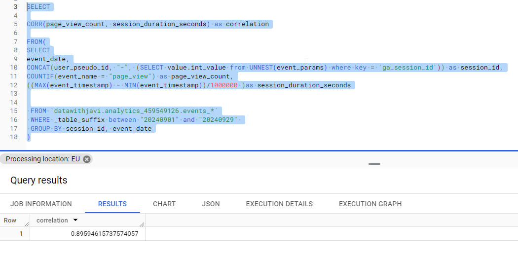
As you can see, for datawithjavi.com pageview counts and session duration have a strong correlation coefficient of .89 which is very close to a perfect correlation.
How to interpret a correlation:
- Perfect Correlation (+-1)
- Strong Correlation (+- 0.7 to 0.9)
- Moderate Positive Correlation (+-0.4 to 0.6)
- Weak Positive Correlation (+-0.1 to 0.3)
- No Correlation (0)
Tools like GA4 offer a wealth of data to a digital marketer. However, relying solely on GA4’s default reports isn't sufficient. This is where descriptive statistics become invaluable, transforming raw data into meaningful a meaningfull understanding of the data you are working with.
Throughout this Descriptive Statistics Crash Course, we’ve explored essential components that empower you to delve deeper into your data:
- Measures of Central Tendency: Understanding the mean, median, and mode helps you identify typical user behaviors and spot outliers that may require further investigation.
- Measures of Variability: Analyzing range, variance, and standard deviation reveals the consistency and reliability of your metrics, allowing you to assess the stability of your campaigns and strategies.
- Distribution and Shape: Visualizing data with histograms helps you detect patterns and anomalies, guiding you to ask the right research questions and formulate hypotheses for deeper analysis.
- Correlation: Exploring relationships between metrics, such as page views and session duration, enables you to optimize user experiences and marketing efforts based on how different factors interact.
Why This Matters:
Mastering descriptive statistics allows you to:
- Gain Deeper Understanding of Your Data: Move beyond GA4’s predefined metrics to uncover a more nuanced understanding of user behavior. Go beyond averages.
- Identify Opportunities and Challenges: Spot trends and outliers that highlight areas for growth or improvement.
- Customize Reporting: Create tailored dashboards that align with your specific business goals, providing more relevant and actionable insights.
- Make Informed Decisions: Base your strategies on solid statistical analysis rather than intuition alone, ensuring more reliable and effective outcomes.
Looking Ahead:
Using descriptive statistics allows you to dive deeper into complex datasets, identify significant patterns, and make informed decisions that go beyond the simple average metrics provided by GA4 reports.
With a solid grasp of descriptive statistics, you’re prepared to start thinking about how to make predictions based on your data.
Continue building your statistical knowledge, and watch your analytical skills—and your results—thrive.